An Art Style for Science Fantasy City
Amberspire Design Diary #11
As the design is settling it was time to fully settle in on a visual style for the game. We had made the big decision to present all the art in 2D, but now the world of the game had to be fully realized with an art style. A future design diary will talk about the factions and art developed for them. See the other design diaries, wishlist the game, or subscribe to our newsletter.
It was initially difficult for me to define what I wanted Amberspire to look like. Science fantasy encompasses so much, it’s hard to clearly define what is right for your setting – Star Wars, Book of the New Sun, Viriconium – all are validly described as science fantasy. It's partially useful to describe what you don't want, but you need to define positive aspects to really go far.
Venice
My initial thinking started off with the world and city should feel like a science fantasy Venice. Not a literal Venice in space, but as a reference for various ideas: architecture, density, and the overall character of the city both literally and culturally. And further, Venice in the pre-renaissance, early medieval period - more on that below.
This was led by technical concerns for the visual identity of the game. I knew it wouldn’t have cars or car-equivalent vehicles moving around the city, and I also wanted the city to be large. Even buildings bounded by streets are not a necessity, many buildings are clumped together and the player can imagine residents moving between them without a direct depiction. I saw the city in the game and Venice as naturally sharing similar qualities, so I wanted the layout to reflect that. The city is also built on an artificial moon constructed as a mausoleum, and as you play the game more of the moon’s substructure is revealed. This constrains how you play the game, and also shapes your city into something unique.
The city of Amberspire should also feel old, built over layers of history, and have a somewhat fated quality to it. Even though the player builds the city in a mechanical sense, I still wanted it to feel old. Metaphorically, the game is also asking if the player is building a city or telling a story about the city from a remove?
Science Fantasy
This process really forced me to consider the science fantasy of the game from a different angle, from the inside out. How does it feel to be a person in this world? What does their day to day life look like, how is food prepared, children cared for, material needs met; how is social, political, and economic life organized? Through this period we also worked with the concept artists Simon Krieg and Rob Turpin, which helped push these ideas forward in my head and solidify our direction.
In some ways I’ve used the Medieval period of Venetian, Byzantine, and Persian history to reflect the outlook of the world in Amberspire. How does one person, or city-state, fit into a larger community of people and nations? Despite the huge advancement in scientific understanding, what remains unknown about the planet and cosmos? I won’t answer all these questions I asked myelf here, because the game answers them as much as I want it to.
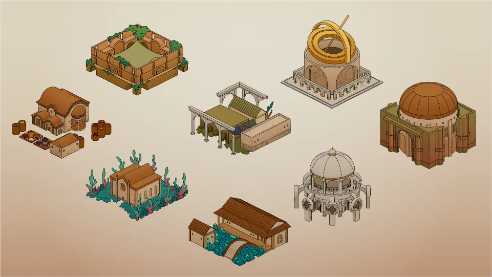
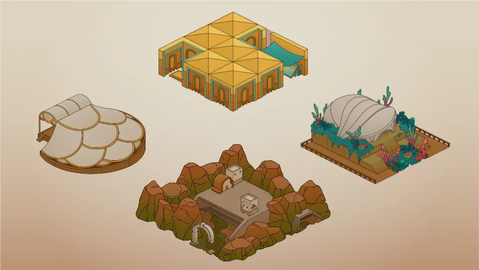
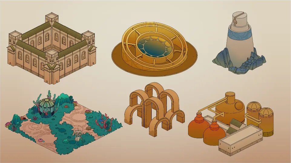
The Art Style
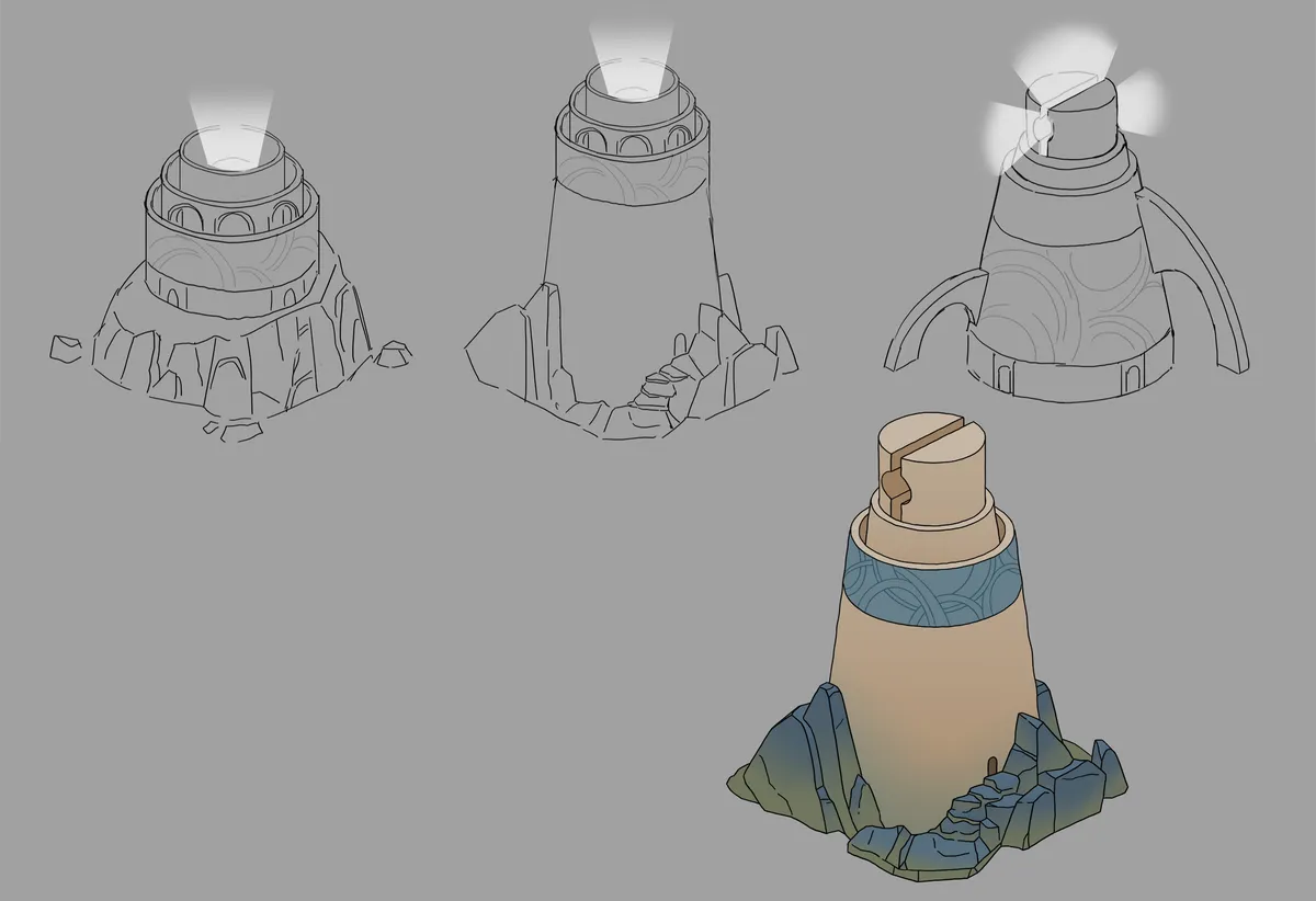
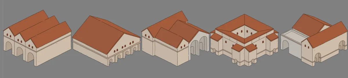
All of these come together to develop the art style of the game. YueTong Tsen is the incredibly talented artist who conceptualized and drew all of the buildings in the game, and was a joy to work with. While I had a lot of ideas in my head, her realization of how buildings are shaped speaks to how the people in the world interact with them.
Eventually the style consisted of these ideas, with some rules occasionally broken:
- A hand drawn outline of consistent weight, both to impart a rough and old feel to the buildings and reinforce that they are 2D images.
- A generally warm color palette for the city, and cool for the surrounding moon.
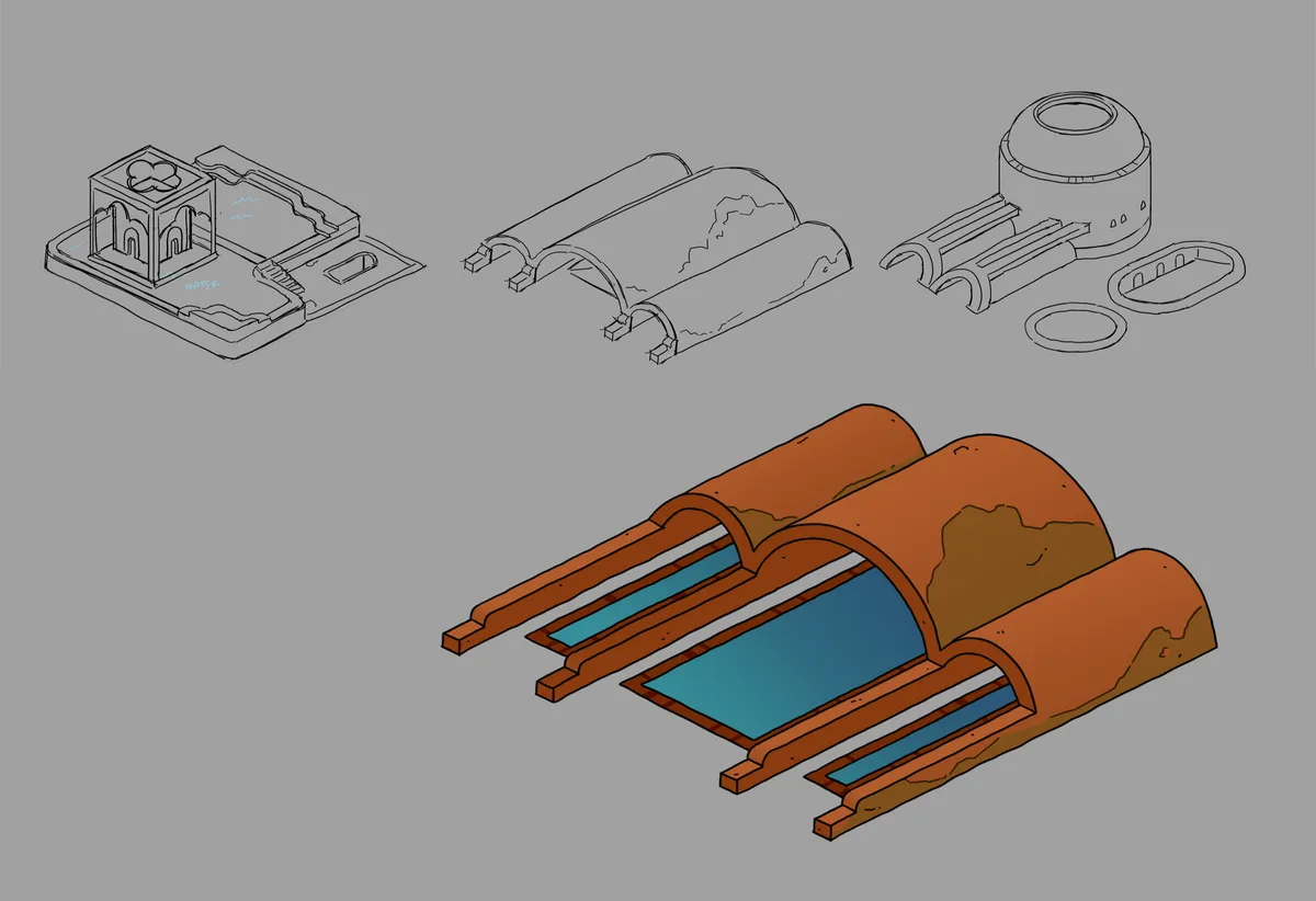
- Lots of gradients, but no shadows. Because the game is in 2D, it would be impossible for buildings to cast shadows on each other, so they don't cast any at all (minus one key exception of a floating building). Gradients are heavily used to ground buildings and give some color and value variation.
- A future blog post will go into detail on the game's visualization of people and props, but initially the buildings were drawn with the expectation that no people would be visible. This meant generally obscuring and simplifying doors and paths, to not draw attention to this detail. The game does show people, but this was done after this direction was established.
- The game doesn't let you rotate your view, so each building has a strong silhouette to distinguish itself from other buildings.
- Most buildings do not take up their full footprint, allowing the streets or other buildings to abut them more naturally and feel less grid-like.
The art style is a result of all this thinking, our preferences and quirks, and Yue's rendering style all working together. Aside from the color palette of the city skewing warm and vibrant, and a rough inspiration of Venetian/Mediterranean architecture, we didn't start with any specifically hard and fast aesthetic rules. The result is the product of iteration and vibes, and better reflects the game's flavor of science fantasy: expansive, bright, and unusual. A warm day at a rocky beach, bioluminescent algae visible beneath the slow waves, a planet low on the horizon.